
Context
In 2012 worked as UX Lead at DDB Sydney.
McDonald's was one of our biggest clients and they were facing a big challenge.
A huge shift in customer behaviour driven by the increased adoption of technology had led to a strong need to provide more extensive content and utility using digital channels. The brand experience online in 2013 however was still very fragmented and there was a need for a destination that would bring thing together.
Over the course of the two years (2012-2014) I worked on the account I was involved in various projects that touched on this and other customer problems.
Redesign McDonalds.au
As UX lead I was responsible for the experience design of McDonalds main website.
Challenge
The wealth of information, online or e.g. critical food documentaries had made people were confused about quality and safety.
Our research pointed out that for many, “Mc” meant "mystery".
And as a result, they felt guilty after eating and didʼt come back.
Approach
I adviced the project managers on a "Design Thinking" approach:
- Customer Insights & Ideation — I collaborated with our strategic planners to map our target audience and uncover their needs. We ran client sessions to gather and prioritise business requirements. Site analytics were used to determine current site issues.
- Experience Strategy & Vision — Key insights were distilled into site rationale. An ecosystem map was plotted and discussed during a client workshop, communicating the larger digital view and demonstrating how our concept would fit in. The main IA concept was defined as a result of card sorting exercise.
- Wireframes & Visual Design — I led a team of three designers to execute journeys into wireframes and design specifications.
- Build & Validation — The rollout was executed using Agile methodology. This was supported by a modular design approach which allowed the devs to prioritise and scope each build appropriately.
We built personas around three key archetypical customer mindsets:
- Loyalists
- Switchers
- Resistors
Solution
We then started to ask people representing these archetypes about things they would expect to be able to do at McDonalds. This resulted in a huge pile of items which we then proceeded to sort. The result was three main pillars:
- Eat — The obvious one: it's all about food for the vast majority of customers.
- Learn — A key business objective as we've also seen in the Track My Macca's.
- Play — Families have a different notion, think about Happy Meals and Kids parties.
Using the three pillars above main guidance we proceeded to organise the site's content and functionality:
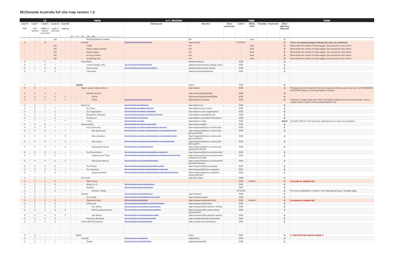
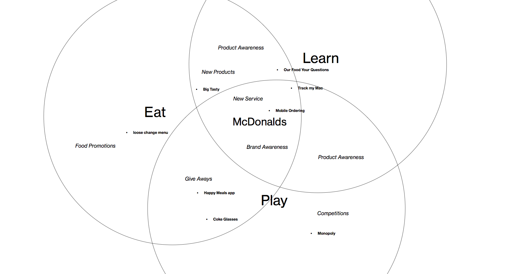
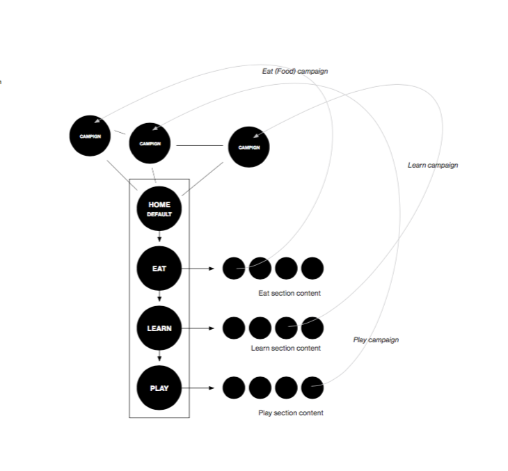
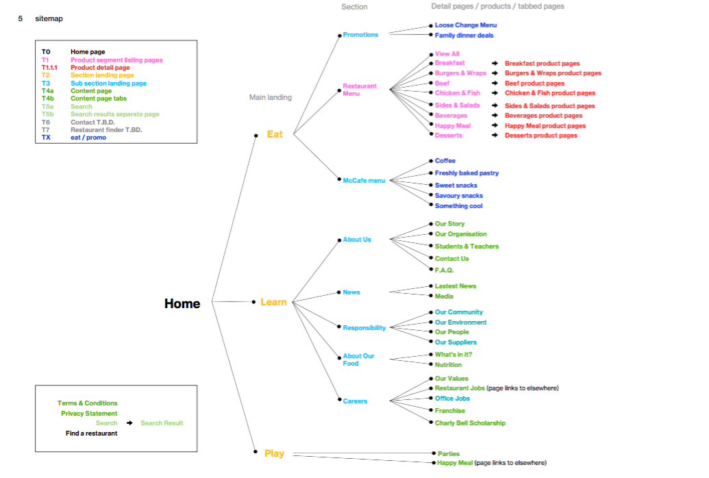
After establishing the IA we worked our way towards a feature roadmap. We started with the user features that had come out of our research phase and combined them with business requirements:
- Restaurant menu explorer
- Nutritional value
- calorie calculator
- Marketing campaign integration
- Ordering
- Delivery
- Search
- Local Initiatives / Sponserships
- Loyality program
- Book a birthday
- Restaurant finder
- Learn about ingredients
- Ronald McDonald Charity
- Career section
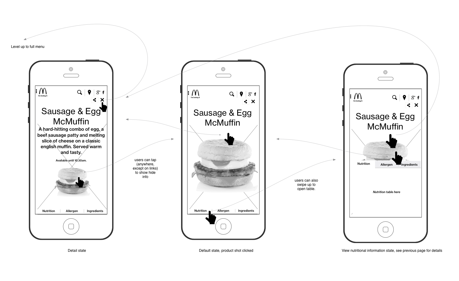
When designing the layouts for tablet and mobile we researched how and for what these devices where used in relation to the content and functionality we were dealing with.
One of our findings was that people like to use their phones to quickly look up the nutritional value of a product they are considering to order.
Outcome
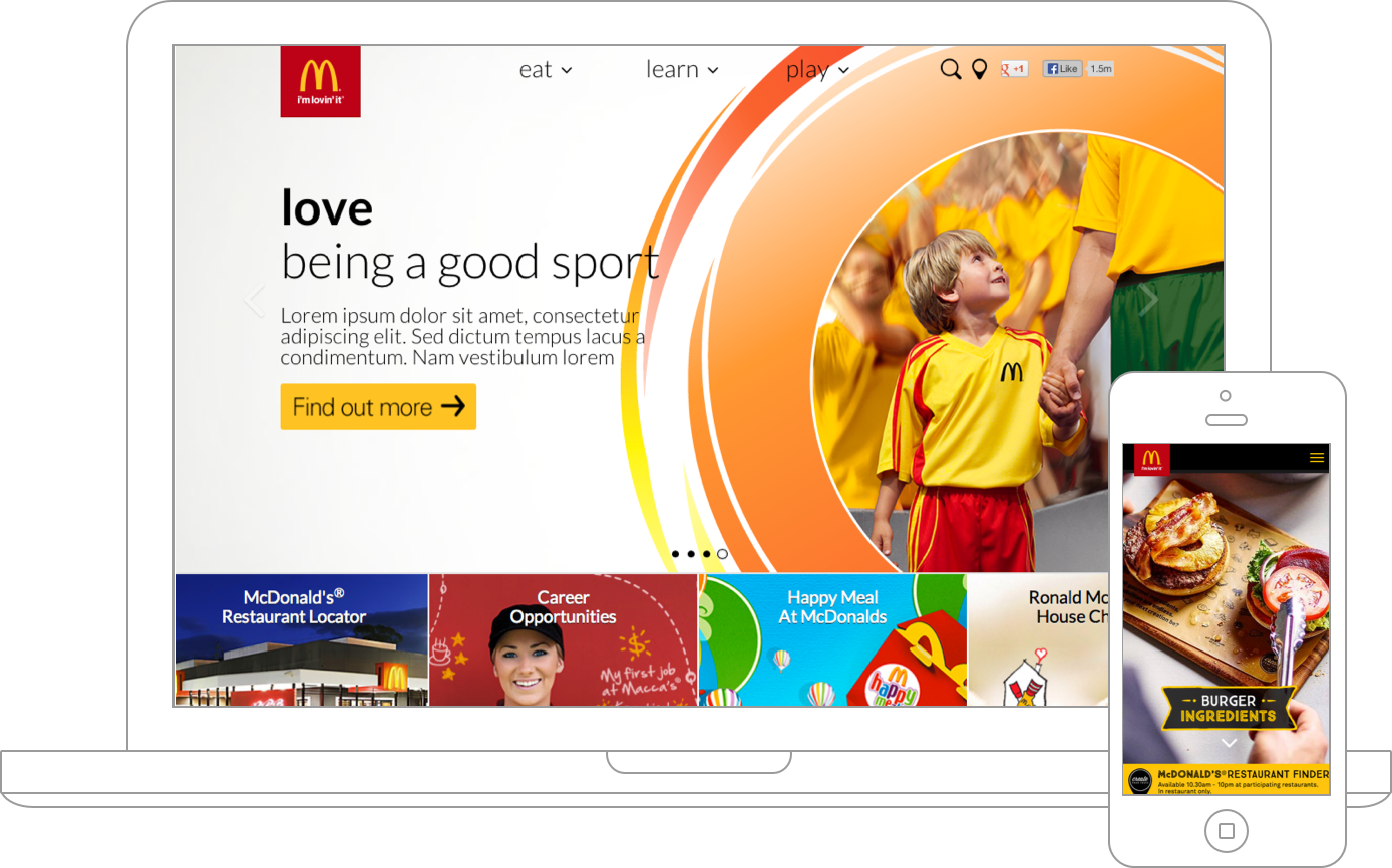
The new experience was received very well by customers. Site traffic got an enormous boost. Mobile visits not only increased but the sessions lasted much longer as well. Landing pages of marketing campaigns could now be seamlessly embedded onto the site itself which resulted in much quicker turnaround times and lower maintaance and development costs for this type of content.SEO improvements were dramatical because of calculated choices in url structure and page templates (all included in UX recommendations).
Overall the redesign was seen as a huge success.The biggest achievement perhaps was that this platform proved modular enough to stay future proof and live on as a foundation for later expansion.
Drive RMHC donations

In 2014 I was asked to rethink the Australian Ronald McDonald House Charity (RMHC) website and social platforms to drive donations.
RMHC has multiple Chapters across Australia.
A Chapter may be responsible for the running of a House, or the running of multiple programs.
Each Chapter has a Board of Management and team of staff and volunteers responsible for running of the programs within their Chapter.
Challenge
The key challenges for this project were:
- Facilitating the needs of the individual divisions ("Chapters", "Houses")
- Analysing the behaviours of donors and figuring out what drives them
- Building a solution to facilitate the organisational structure
Through visits and workshops we learned how the organisation worked and how it was structured.
Approach
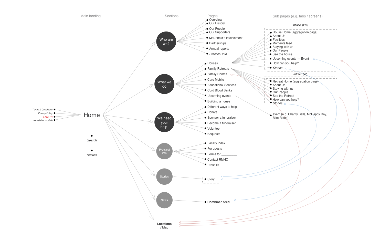
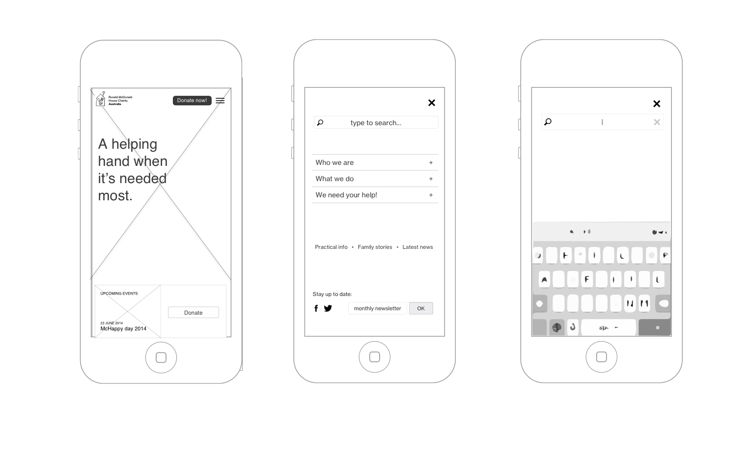
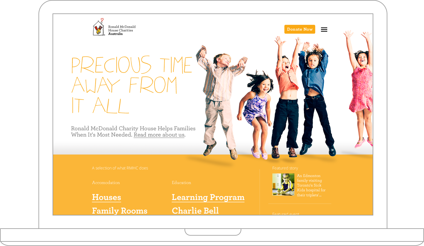
Realising the needs of each program in terms of independance, we came up with a solution that would let staff publish using their own, pre-existing social media channels (e.g. Facebook pages, Twitter feeds, Facebook Events, etc.). We then aggregated this content and brought it together in a simple structure. This way each program could retain their independance but the whole experience was still structured and consistent while the reach was also optimised using appropriate channels to reach the potential donors.
We gathered and formalised our findings into personas. We built these to communicate our findings easily and to determine the functional scope of our product.
We used pre-existing research such as Donor Perspectives - Blackbaud and we also conducted our own research by interviewing RMHC staff and asking peers:
- Why do people donate?
- How do people donate?
- Donation size, frequency and occasion
- Trends and changes in the above
Once our findings were summarised into a persona grid, we plotted persona journeys and worked through these with the client to validate our ideas. We used the journey templates from the Service Design Toolkit.
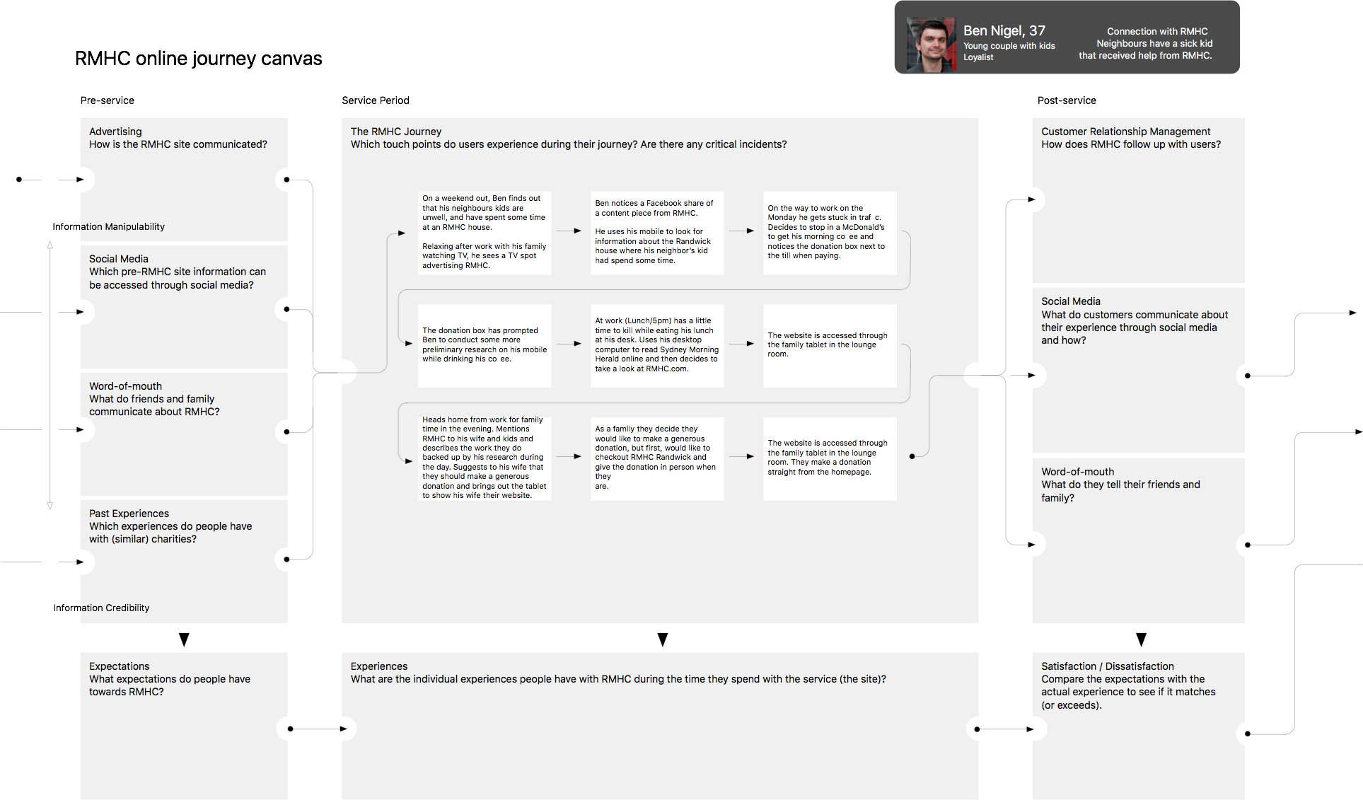
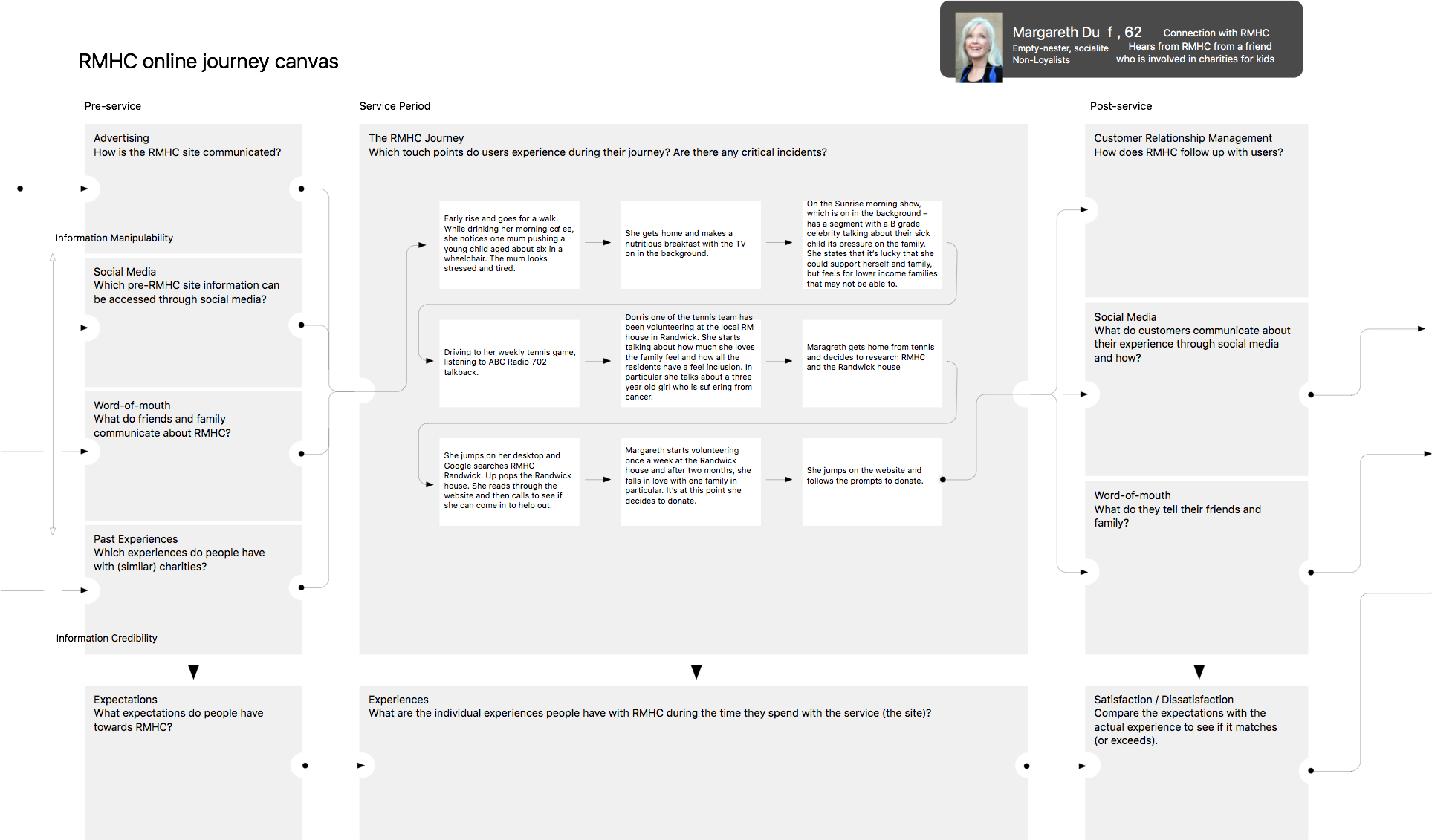
Pre-, during- and post service experience of one donor leading into …the next.
Outcome
Track My Macca’s
Track my Macca's was an award-winning campaign and iOS augumented reality app that let customers follow their food’s journey in real time
Challenge
"Where does my beef patty come from?", a common question that often leads to the wildest stories if asked in any fastfood restaurant.
The majority of people loved the food at Macca’s (that’s how Australians like to call McDonalds) but few actually believed the ingredients were fresh and from local suppliers.
The strategy of using traditional media to get the message across wasn't not working, as 50% of Australians still did’t believe that the ingredients in their Big Macs were actually fresh and local. It seemed that traditional mass media advertising was not the best vehicle to build credibility and bust the myths. So the task was to find a new way to generate a positive conversation with the customers.
Approach
The idea was to create an iPhone app that would later be called "TrackMyMacca's". It let users get to know several McDonald products inside out. Using the App along with the phone's GPS sensor, users could track where ingredients in the actual food they just bought came from.
I worked closely together with a strategic planner to conduct research to gather insights around the target audience: young mum's. We summarised the ourtcomes into persona's and wrote user stories that were translated into journey maps with cross-channel touch points.
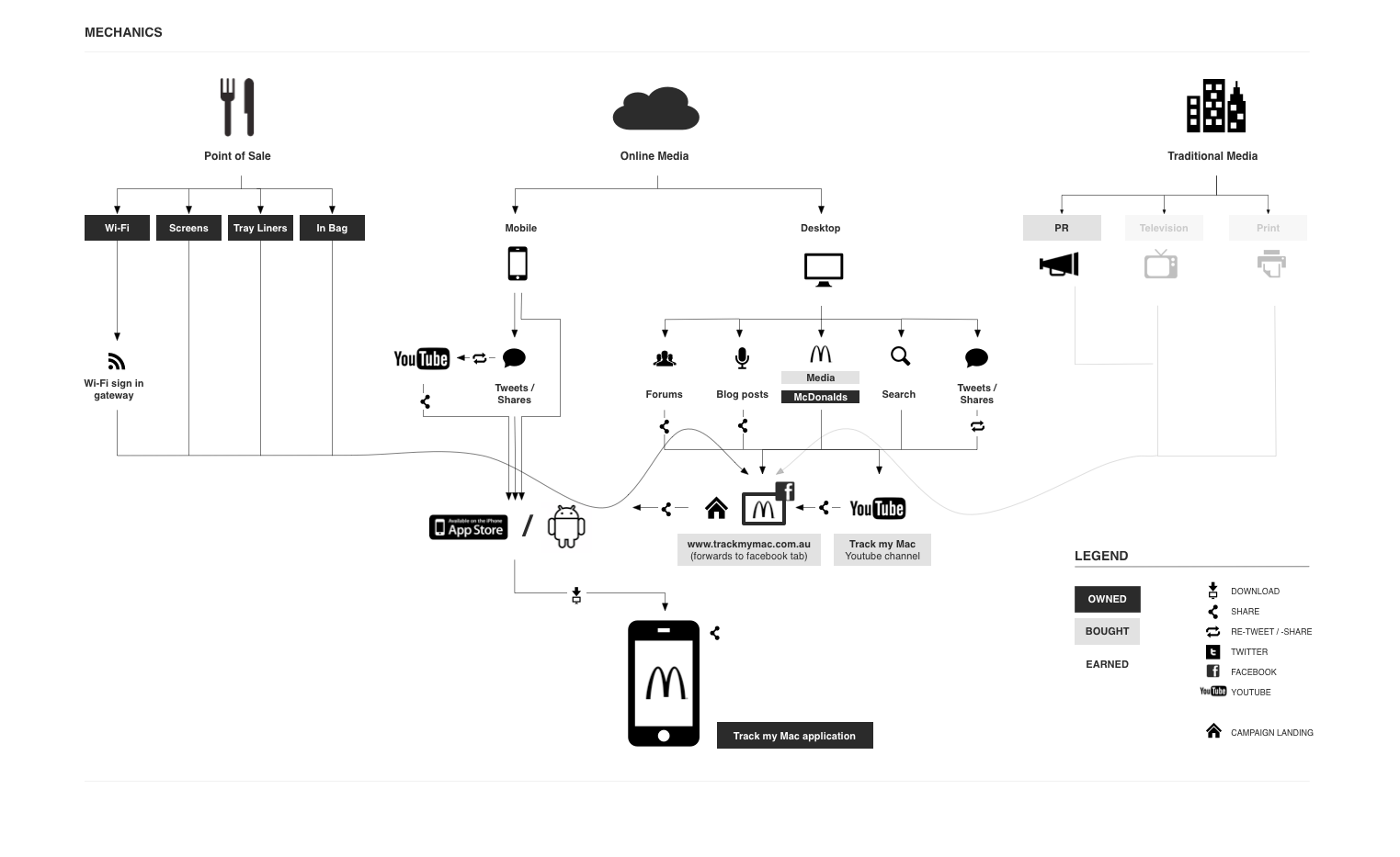
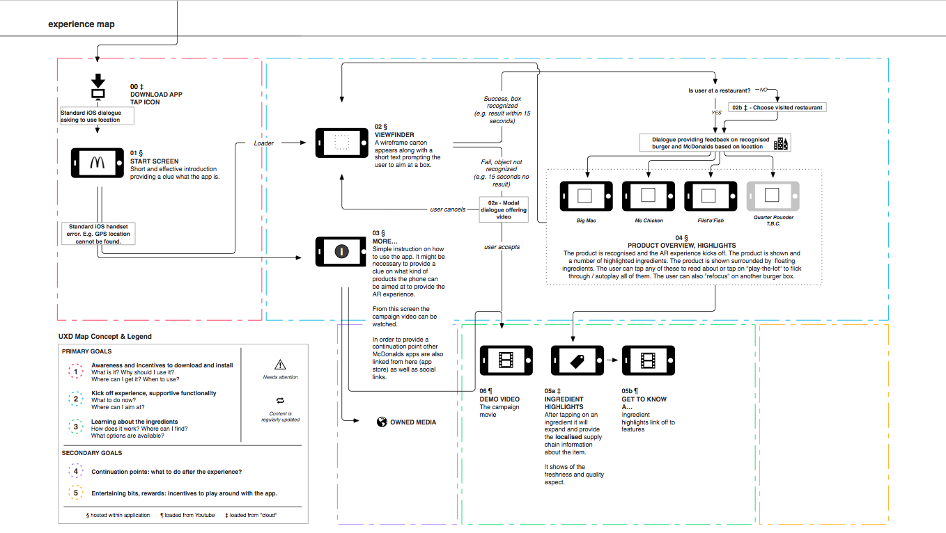
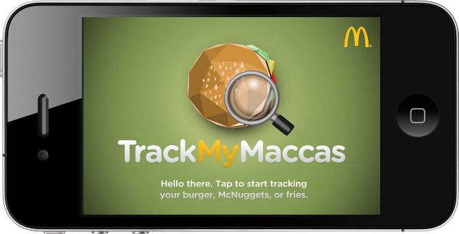
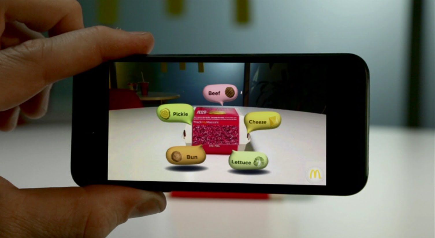
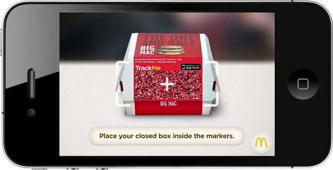
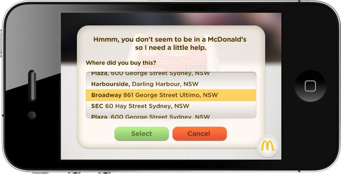
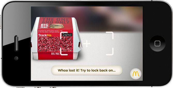
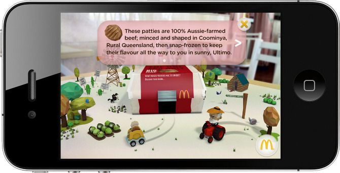
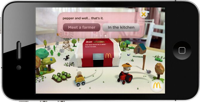
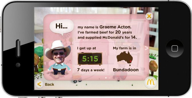

To help tell the story where ingredients were sourced from in an engaging way, each product featured its own animated environment that was projected using Augmented Reality. The visual style, transition and animation all play an important role in the user experience.
Outcome
Awards
- FWA (MOTD)
- AICP Next Awards (Shortlist)
- Cannes Media Lion (Gold - Best Use of Mobile Devices)
- Cannes Mobile Lion - Augmented Mobile Experience
- Cannes Promo + Activation Lion Best Integrated Campaign
To comply with my non-disclosure agreement, I have omitted and obfuscated confidential information in this case study.
The information in this case study is my own and does not necessarily reflect the views of McDonalds or DDB.


